Tableau Dashboard: New York City AirBnB Data Visualization
Short Description of the Project
In this project, I have visualized the New York City AirBnB data in a Tableau dashboard. The dataset was downloaded from Kaggle. Before implementing the dashboard, I have created separate sheets involving different dimensions and measures. I will discuss each sheet thoroughly with some insights step by step.
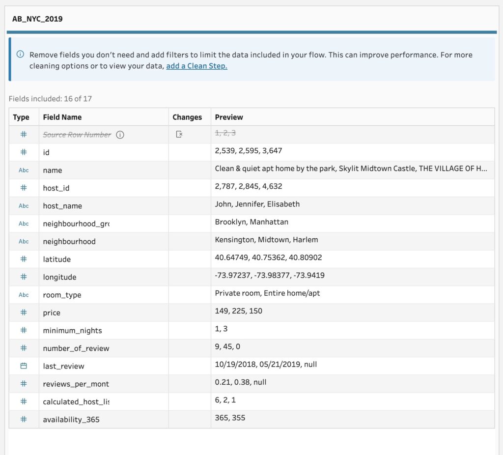
At first, the downloaded dataset is loaded on Tableau Prep Builder. The data fields of the dataset are shown in Figure 1. As it is seen that the source row number is not a relevant field, it was excluded. Other fields include host informations, geographical locations, neighborhoods and groups. There are measures such as price, number of reviews, reviews per month, etc.
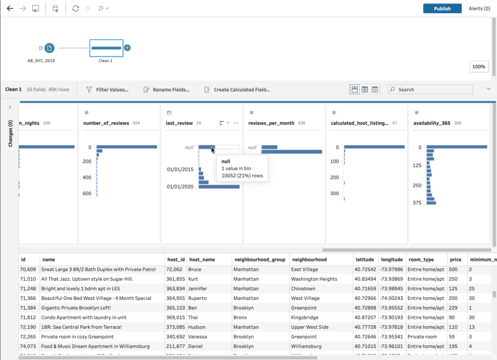
Next, I added clean step, shown in Figure 2. There are null values found in name, host_name, last_review and reviews_per_month. Since name and host_name is not necessary for this data visualization project, I did not exclude them. The null values of last_review and reviews_per_month columns were excluded which takes 21% of the total values. Also, I have excluded all the data before 2018. I only considered the data of 2018 and 2019.
Figure 1: The data fields after importing the data
Figure 2: Null values in data cleaning step
Tableau Dashboard of AirBnB Data of New York City
Data Analysis
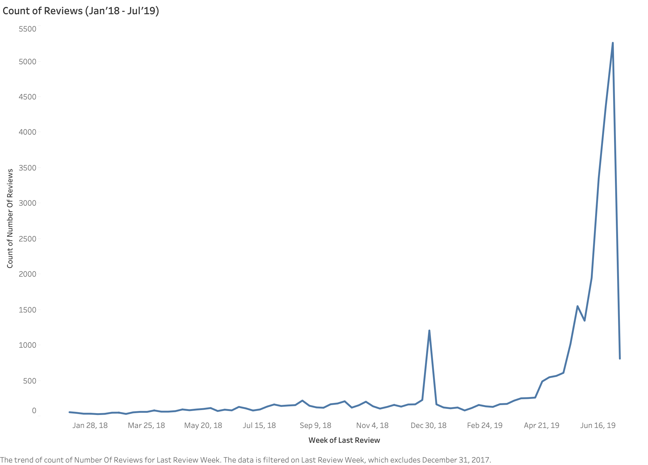
Line Plot for Count of Reviews
The line plot in Figure 3 shows the count of reviews over the weeks from January 2018 to June 2019. The observation from the plot is that there is a spike on review counts on the last week of December 2018 and the first week of January 2019. It indicates the Christmas and the year end vacation season. But the sharp increase of review count starts from the second week of May 2019 (~600). It reaches the highest peak on the last week of June 2019 (~5200) and a gradual decrease until the first week of July 2019 (~800). The rise indicates the increase of tourists during the summer season. According to the line plot, this is the best time to collect the customer reviews.
Figure 3: The weekly count of reviews over the time period January 2018 to July 2019.
Distribution of Listings by Neighborhood Groups
All the listings are distributed according to colors and grouped by the Neighborhoods in Figure 4. The distribution shows that Manhattan and Brooklyns are the most densely distributed areas for AirBnB listings. Distribution in Queens is very large and scattered. Bronx is much smaller in area but the distribution is sparse. The least distribution is observed in Staten Island.
Figure 4: Distribution of Neighborhood groups. Blue = Bronx, Orange = Brooklyn, Red = Manhattan, Tiel = Queens and Green = Staten Island
Density Map for Average Prices
From the density map in Figure 5, it is seen that the lower (southern) part of Manhattan is the most expensive area. Another expensive area is the northern part of Brooklyn, especially the areas adjacent to lower Manhattan. Queens, Bronx and Staten Island are moderate to least expensive areas.
Figure 5: Density map for average prices. The green to orange gradient colors indicate the low to high price respectively.
Bar Chart of Average Price by Room Type
From figure 6, it is seen that renting entire home / apartment is most expensive in Manhattan with an average of 243.3 USD. The lowest place to stay in an entire home / apartment is staten island (on an average 118.9 USD). For private room rental, Manhattan is most expensive and Bronx is least expensive with an average price of 104.5 and 56.9 USD respectively. An interesting fact is that, in staten island the average price of private room and shared room is almost similar. The cheapest shared room can be found in Bronx (38.6 USD) and Manhattan costs the highest average price for the shared room.
Figure 6: Bar chart of average price by room type for each neighborhood group.
Bar Chart of Average Price by Neighborhood
I have created bar charts of average price by Neighborhood in figure 7. Since figure 7 is not coped horizontally on this width, I can refer the Tableau dashboard for clearer view. According to the chart, Sea Gate of Brooklyn has the highest average price for rental i.e. 806 USD. The lowest rental is in New Dorp Beach of Staten Island, 38 USD.
Figure 7: Bar chart for average price by neighborhood.
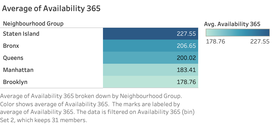
Highlight Table for Average Availability 365
To analyze the average availability of rooms in 365 days, we excluded 0’s. After the exclusion, we created a highlight table, shown in figure 8. It can be seen from the figure that Staten Island has the highest availability (227.55 days) of rooms, followed by Bronx (206.65 days), Queens (200.02 days) and Manhattan (183.41 days). Finding room in Brooklyn can be most difficult with an average availability of 178.76 days out of 365 days.
Figure 8: Average of availibility of AirBnB rental in 365 days.