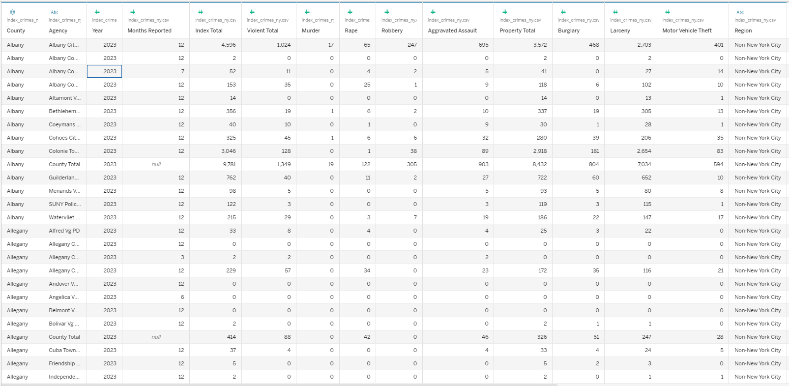
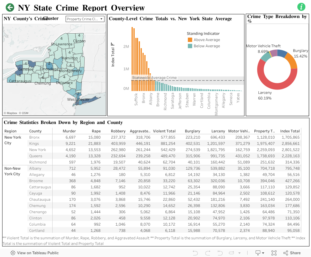
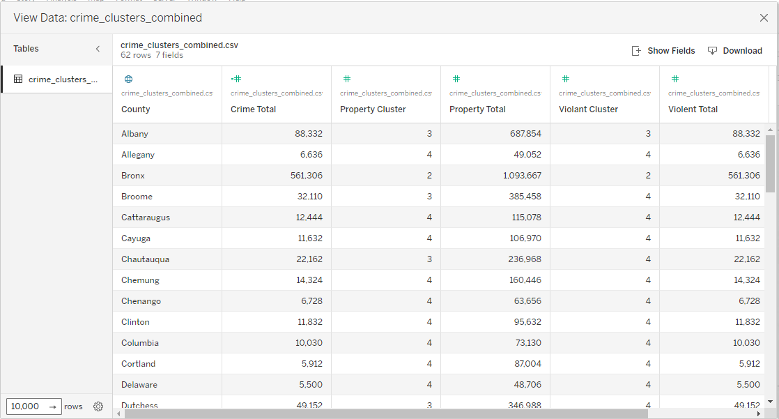
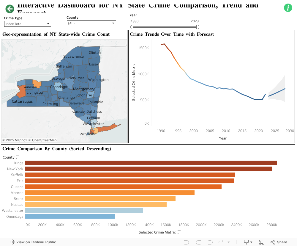
Short Description of the Project
This interactive dashboard presents a comprehensive analysis of crime patterns across New York State, offering insights into both violent and property crime trends. Leveraging clustering techniques, mapping tools, and temporal breakdowns, this visualization enables data-driven discussions about public safety across counties.
Tools and Technologies Used
- Tableau Desktop 2024.3
- R Studio 2024.12.0
- R version 4.4.2
Data Definition
The original dataset was downloaded from NY open data website. This dataset is named as index_crimes_ny and imported to Tableau. The dataset is shown below:

Each of the variables in the dataset are defined below:

Motor Vehicle Theft: One count per victim. The theft or attempted theft of a motor vehicle, including automobiles, trucks, buses, motorcycles, and snowmobiles.
Region: Region where the crime was reported. Regions include New York City (Bronx, Kings, New York, Queens, and Richmond counties) and Non-New York City (all other counties).
Table of Contents for New York State Crime Analysis Dashboard
The tables of contents dashboard consists of two dashboards- NY State Crime Overview and Crime Trends and County Comparison. The user can click the desired dashboard to view it, and inside each of the dashboards, there is a “Back” button that brings the user back to the table of contents dashboard. This dashboard also provides information about the views in each of the dashboards, helpful as a high-level overview.
NY State Crime Overview Dashboard
The NY State Crime Overview Dashboard contains four views- NY County’s Crime Cluster, County-Level Crime Totals vs. New York State Average, Crime Type Breakdown by %, Crime Statistics Broken Down by Region and County. Details about each view are given below.
NY County's Crime Cluster View
This view clusters NY counties in four groups- 1 to 4, 1 indicating the “Most Crime”, to 4 indicating the “Least Crime”. Users can select between two categories – Violent Crime Cluster and Property Crime Cluster from the drop-down menu. This view helps the users understand the most crime-prone zones. For example, in the property crime category, counties like New York, Suffolk, Kings, Queens, Erie, and Monroe fall under cluster 1, indicating the most crime zone, New York being the top with a total of 2.2 million. For violent crimes, Kings is standing alone in cluster 1 with the highest totals of 865 K, followed by Bronx (561K), New York (531K), Queens (477K), and Erie (330K), falling under cluster 2.
K-means Algorithm for Crime Clustering: To create the crime clusters K-means algorithm has been implemented in R. The sample code for violent crime clustering is given below. The same technique has been applied in the property crime clustering output. The output files have been combined to get a final dataset, containing cluster numbers.
Sample code:
library(tidyverse)
library(cluster)
library(factoextra)
library(scales)
crime_data <- read_csv("index_crimes_ny.csv")
crime_2022 <- crime_data %>%
filter(Year >= 1990, Year <= 2022)
crime_by_county <- crime_2022 %>%
group_by(County) %>%
summarise(
Violent_Total = sum(`Violent Total`, na.rm = TRUE)
)
crime_scaled <- crime_by_county %>%
column_to_rownames('County') %>%
scale()
fviz_nbclust(crime_scaled, kmeans, method = "wss")
k <- 4
set.seed(123)
# Run K-means
kmeans_result <- kmeans(crime_scaled, centers = k, nstart = 25)
# Add initial cluster labels
crime_clusters_violent <- crime_by_county %>%
mutate(Cluster = kmeans_result$cluster)
# Compute new cluster labels based on average Violent_Total (descending)
cluster_order <- crime_clusters_violent %>%
group_by(Cluster) %>%
summarise(Violence = mean(`Violent_Total`)) %>%
arrange(desc(Violence)) %>%
mutate(NewCluster = row_number())
# Reassign cluster labels
crime_clusters_violent <- crime_clusters_violent %>%
left_join(cluster_order, by = "Cluster") %>%
mutate(Cluster = factor(NewCluster)) %>%
select(-NewCluster, -Violence)
# Save to CSV
write_csv(crime_clusters_violent, "crime_clusters_violent.csv")
Combined Clustering Output Data:

County-Level Crime Totals vs. New York State Average
This view provides a better understanding of the crime situation of a specific county. An average line divides all the counties into two markers- above (orange) and below average (teal). For example, Oneida, Schenectady, Saratoga are considered below average, whereas Nassau, Suffolk, New York, Albany, Queens, etc. are some of the above average counties. Niagara is just above the average line (466K), with the index total of 488K.
Crime Type Breakdown by %
A donut chart is represented in this view that provides a crime type breakdown by percentage. Larceny occupies the highest percentage of crime statewide, with 60.2%, followed by Burglary (15.4%). The lowest percentage was reported for murder (0.2%), followed by rape (0.8%), with 229K reported.
Crime Statistics Broken Down by Region and County
In this table view, more granular information is presented. The counties are grouped by New York City and non-New York City regions. A breakdown by each crime type count is listed, along with violent total, property total, and index total for each county. The data shows that with 881.2K, Kings County has the highest total violent crime counts- murder (9.2K), rape (21.9K), robbery (404K), aggravated assault (446.2K). The highest number of burglaries was reported in Erie County, 439.3K, whereas Motor vehicle thefts were highest in Queens (431.1K). New York stood top for Larceny (1.8M) and property crimes (2.3M). Hamilton County has the lowest crime in every category due to being sparsely populated, index total of 5.3K only.
Interactive Dashboard for NY State Crime Comparison, Trend and Forecast
The Interactive Dashboard for NY State Crime Comparison, Trend and Forecast contains three views- Geo-representation of NY State-wide Crime Count, Crime Trend Over Time Forecast, and Crime Comparison by County. There are three filters available to the users- Crime Type, County, and Year. Details about each view are given below.
Geo-representation of NY State-wide Crime Count
This view shows NY counties in orange-blue diverging colors based on the count of the Crime Type Filter. For example, if “Motor Vehicle theft” is selected from the Crime Type dropdown filter, the dark-orange color is shown for Queens, having the highest motor vehicle theft reported- 431.1K. The Kings county shows orange color, being the runner-up with 371.3K crime counts. Erie county is in third position with 225.1K counts, shown in light-orange color. However, the Year filter is applied from 2013 to 2023 (10 years), it is seen that Erie county (dark-orange) has reported the highest motor vehicle theft (41.1K), followed by Monroe (orange), 37.5K.
Crime Trend Over Time Forecast
This view represents crime forecasting over time using time series analysis. Different filters can be applied to get the preferred forecasting. For example, if we want to know Albany’s estimate of the index total for the years 2025 and 2026 using 2000 to 2023 data, the answer would be 15.7K and 15.3K, respectively. Another interesting question will be: What is the total index trend for New York City by 2028? To answer that, we can set the filter to the NYC counties: Kings, Queens, Manhattan, Bronx, and Richmond, and see the forecast. The answer is that, for NYC counties, the index total trend is upward, climbing to 369K by 2028 (estimate) while the actual count in 2022 is 237.7K.
Crime Comparison by County
A bar chart view that shows the total count for the selected crime type for each county. If we want to see how the murder crimes were across the NY counties since Covid-19 (2019), the answer would be Kings County saw the highest murder (700), followed by Erie (646), Monroe (604), Bronx (595), and New York (379). On the other hand, Orleans, Putnam, Warren, and Wyoming have seen no murders within this period.